Template:Tooltip: Difference between revisions
From HorizonXI Wiki
m added option to add css classes |
m added option to add css styles |
||
| Line 1: | Line 1: | ||
<onlyinclude><includeonly><span id="{{anchorencode:{{{id|{{{text}}}}}}}}" class="advanced-tooltip {{{add-classes}}}" style="border-bottom:{{default|{{{underline|}}}|thin dashed grey}}; cursor:default; display:inline-block;">{{{text}}}<span id="{{anchorencode:{{{id|{{{text}}}}}}}}-tooltip" class="tooltip-contents hidden">{{{tooltip}}}</span></span></includeonly></onlyinclude> | <onlyinclude><includeonly><span id="{{anchorencode:{{{id|{{{text}}}}}}}}" class="advanced-tooltip {{{add-classes|}}}" style="border-bottom:{{default|{{{underline|}}}|thin dashed grey}}; cursor:default; display:inline-block; {{{add-styles|}}}">{{{text}}}<span id="{{anchorencode:{{{id|{{{text}}}}}}}}-tooltip" class="tooltip-contents hidden">{{{tooltip}}}</span></span></includeonly></onlyinclude> | ||
__NOTOC__ | __NOTOC__ | ||
[[Category:Templates|{{PAGENAMEE}}]] | [[Category:Templates|{{PAGENAMEE}}]] | ||
| Line 24: | Line 24: | ||
*You can change the opacity with an ''opacity'' parameter with any decimal value between 0 and 1 (default is 0.92). | *You can change the opacity with an ''opacity'' parameter with any decimal value between 0 and 1 (default is 0.92). | ||
*You can change the underline style with the ''underline'' parameter (default is "thin dashed grey"). | *You can change the underline style with the ''underline'' parameter (default is "thin dashed grey"). | ||
* | *You can add any css classes to the element with the ''add-classes'' parameter. | ||
*You can add any css styles to the element with the ''add-styles'' parameter. | |||
===Caveats=== | ===Caveats=== | ||
When using this template to transclude data that includes a table, it will break. | When using this template to transclude data that includes a table, it will break. | ||
Latest revision as of 14:21, 29 October 2023
Usage
{{Tooltip
| text = [[Jugner Forest]]
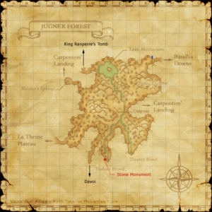
| tooltip = [[File:JugnerForest.png|300px]]
}}
- text sets the text that will be rendered where this template is placed.
- tooltip sets the wikicode that will be in the tooltip when the text is hovered over.
Optional Parameters
- If there is more than one tooltip on a page with the same text parameter, only the first one will work. Set the template's id parameter to be unique for each tooltip.
- If you need to force a particular width for the tooltip, you can set a width parameter with any valid CSS dimension value.
- Using lots of tooltips on a single page can greatly inflate the size and load time. If you set an ajax parameter to yes, the tooltip will not be loaded until the user hovers over it.
Style
- You can force border and padding sizes by setting their respective parameters to any valid CSS dimension values. The default is a "1em" padding, and a "1px" border.
- You can change the background color with the bgcolor parameter (default is "#E9E9E9").
- You can change the border color with the bordercolor parameter (default is "#A3B1BF").
- You can change the opacity with an opacity parameter with any decimal value between 0 and 1 (default is 0.92).
- You can change the underline style with the underline parameter (default is "thin dashed grey").
- You can add any css classes to the element with the add-classes parameter.
- You can add any css styles to the element with the add-styles parameter.
Caveats
When using this template to transclude data that includes a table, it will break.
Example
{{Tooltip
| text = [[Jugner Forest]]
| tooltip = [[File:JugnerForest.png|300px]]
}}
Result: Jugner Forest.
and
- Result: Jugner Forest.

